

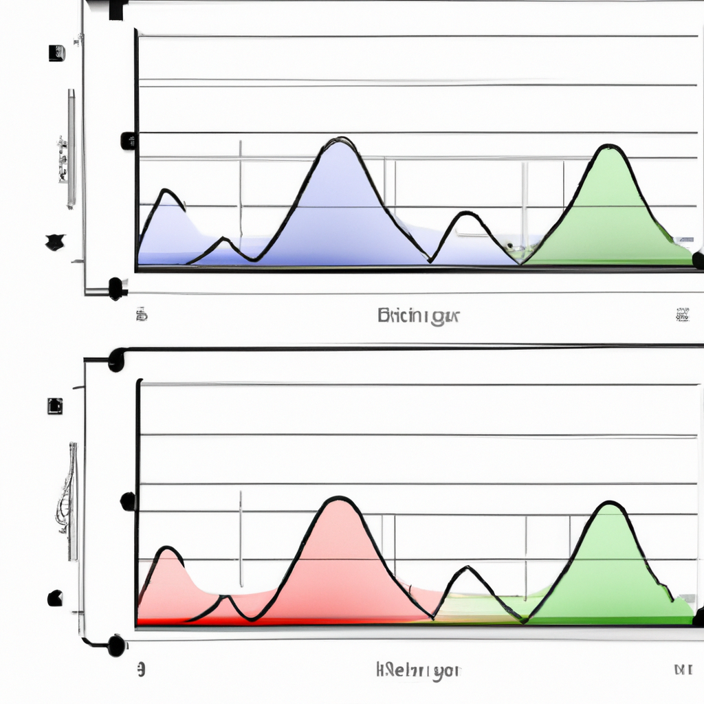
MACD Histogram Interpretations
The MACD (Moving Average Convergence Divergence) histogram is a popular technical analysis tool used by traders to identify potential buy or sell signals in financial markets. It is derived from the MACD line and signal line, which are calculated using exponential moving averages. The histogram represents the difference between these two lines, providing valuable insights into the momentum and trend strength of an asset. In this article, we will explore the various interpretations of the MACD histogram and how it can be used effectively in trading decisions.
1. Positive Histogram
A positive MACD histogram occurs when the MACD line crosses above the signal line and the histogram bars turn positive. This indicates a bullish signal and suggests that the asset’s price is likely to increase. Traders often interpret this as a buying opportunity, as it signifies upward momentum and potential upward price movement.
Furthermore, the height or length of the positive histogram bars can provide additional information about the strength of the bullish signal. The taller the bars, the stronger the momentum and the more significant the potential price increase.
2. Negative Histogram
A negative MACD histogram occurs when the MACD line crosses below the signal line and the histogram bars turn negative. This indicates a bearish signal and suggests that the asset’s price is likely to decrease. Traders often interpret this as a selling opportunity, as it signifies downward momentum and potential downward price movement.
Similar to positive histograms, the height or length of the negative histogram bars can provide insights into the strength of the bearish signal. The taller the bars, the stronger the momentum and the more significant the potential price decrease.
3. Divergence
One of the most powerful ways to interpret the MACD histogram is through divergence. Divergence occurs when the direction of the histogram differs from the direction of the asset’s price. This can be either bullish or bearish divergence.
Bullish divergence happens when the price of the asset is making lower lows, but the MACD histogram is making higher lows. This suggests that the downward momentum is weakening, and a potential trend reversal or price increase may occur. Traders often look for bullish divergence as a signal to enter long positions.
On the other hand, bearish divergence occurs when the price of the asset is making higher highs, but the MACD histogram is making lower highs. This indicates that the upward momentum is waning, and a potential trend reversal or price decrease may happen. Traders often consider bearish divergence as a signal to enter short positions.
4. Zero Line Crossovers
Zero line crossovers are another important interpretation of the MACD histogram. A zero line crossover happens when the histogram bars cross above or below the zero line. When the histogram crosses above the zero line, it indicates a potential shift from bearish to bullish momentum. Conversely, when the histogram crosses below the zero line, it suggests a potential shift from bullish to bearish momentum.
Traders often use zero line crossovers as confirmation signals for their trading decisions. For example, if the MACD histogram crosses above the zero line, confirming a positive histogram, it may reinforce a bullish signal and provide additional confidence to enter a long position.
Conclusion
The MACD histogram is a versatile tool for traders to analyze the momentum and trend strength of an asset. By understanding the various interpretations of the histogram, traders can make informed decisions about when to enter or exit positions. Whether it’s positive or negative histograms, divergence, or zero line crossovers, the MACD histogram provides valuable insights into market conditions and can enhance trading strategies.